Understanding Logo Styles and How They Can Change Over Time
This page is segregated into three categories; 1 the thought process of developing a logo that fits the customer’s needs, 2 a visual display of the various styles of logos (you’ll be surprised at how many there are), and 3 some examples of how popular logos have changed their look over time.
A logo is needed. Where do we start?
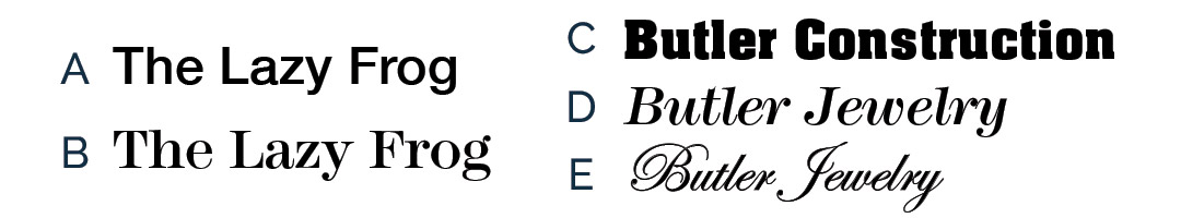
The Simple Text Logo
Today, many professionals go with this clean, conservative look (A). Change the font to a serif face and it adds a bit of sophistication (B).
Then one must decide as to the weight of the font (light, medium, bold, etc.) and, whether the type should be italicized. The style of lettering considered, should compliment the business or object it represents.
For example, “Construction” companies should use a “Strong, Bold” font (C).
For a Jeweler, we would want to use a more elegant font like an Italic (D) or Script (E) .

Text Logo with Stylized Font
There are thousands of fonts in circulation. True, the font should express the image of the company, but we keep in mind that the owner or board of directors must be pleased with it. We will make suggestions and create rough graphic designs but the customer, of course, has the last word.
Above is but a small sample of different type faces with some in Initial Caps and some in UPPERCASE.
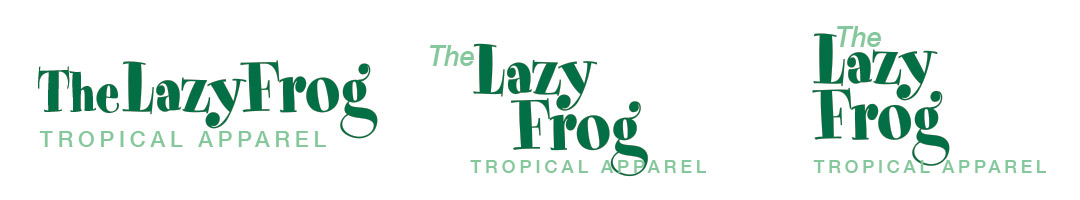
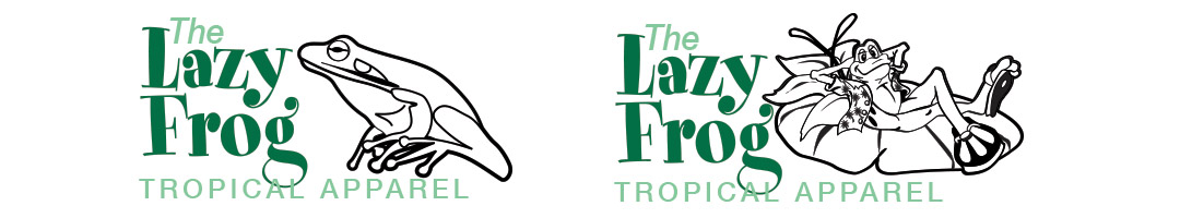
Text Logo with a bit of Flare
We chose a “fun” type face that we feel works well with what they sell . . . “Tropical Clothing” (flowered shirts, sandals, etc). It still does not express what kind of business the Lazy Frog is. Sometimes a tag line needs to be attached in a different, neutral typeface and perhaps color.
Text Logo with Graphic
A graphic element is strongly suggested for most organizations. We usually incorporate a graphic with their text for visual impact. Sometimes the artistic portion is all one needs to recognize what business it represents. This attribute is usually reserved for those businesses that advertise their brand extensively. As an example of this, if you saw two gold arches, you are aware that you are looking at McDonalds®. A graphic “swoosh” is all you need to see that you are looking at a Nike® product.
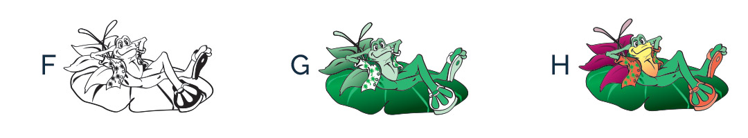
Intricate Logo and Color
Not too many logos are being used today in one color (F) except with certain applications such as return envelopes, invoices, checks, etc. In some cases, an additional color adds an interesting look (G). With today’s advanced technology, it is possible to create and print a logo that is quite intricate. The sample logo, as displayed here in full color (H), will suffice for most needs.
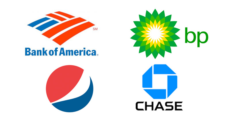
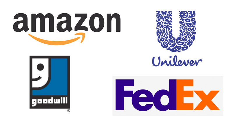
What are the different styles of logos available?
There are several types of logos including; Just Font, Font with Shape, Font with Meaning, Hand Drawn Lettering, Initials, Abstract Graphic, Geometric Symbol, Silhouette, Seals, Crests & Emblems, Detailed Illustrations or Mascots.
JUST FONT

INITIALS
FONT WITH SHAPE
ABSTRACT GRAPHIC
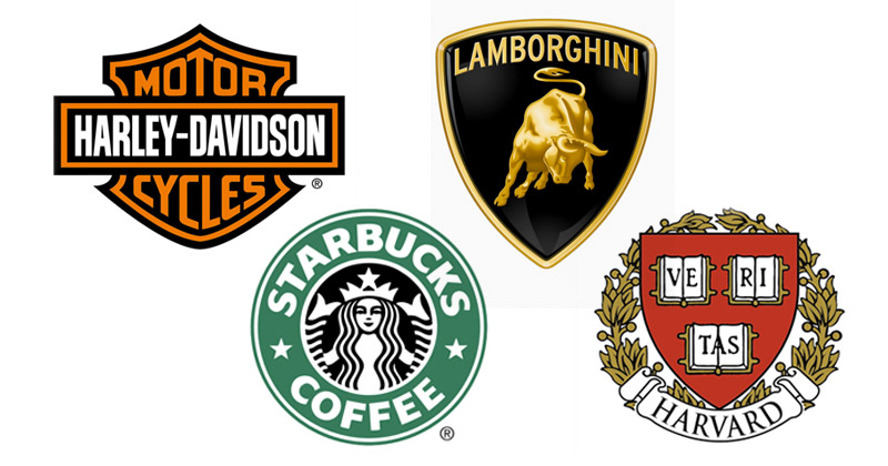
SEALS, CRESTS & EMBLEMS
FONT WITH MEANING
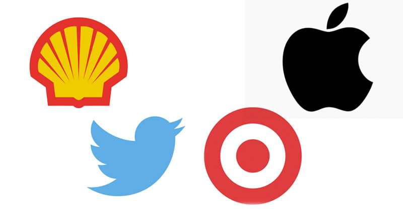
GEOMETRIC SYMBOL
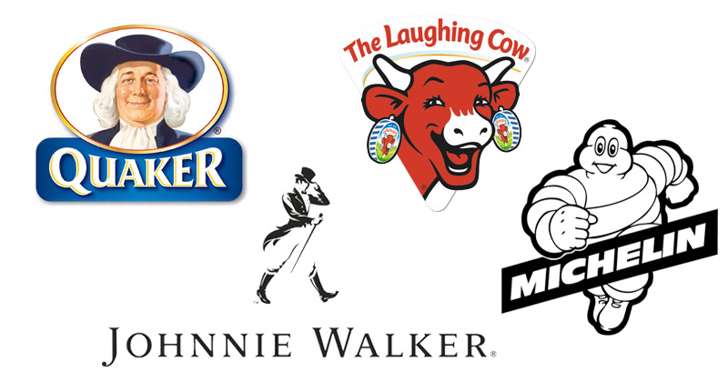
DETAILED ILLUSTRATIONS AND MASCOTS

HAND DRAWN LETTERING
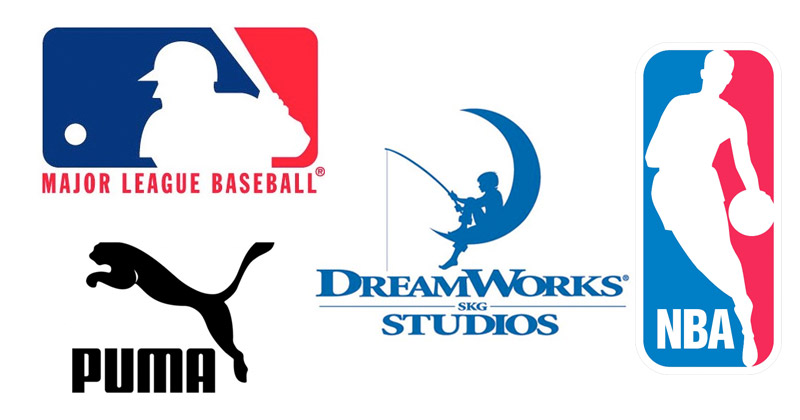
SILHOUETTE
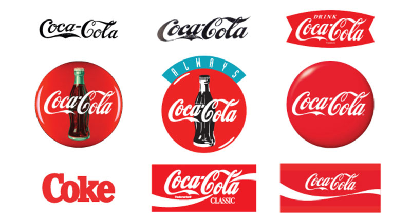
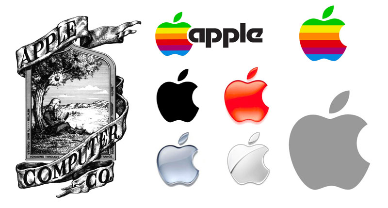
The Evolution of Some Popular Logos